Comparing mobile-first and responsive programming approaches
Building websites on desktop and downsizing them to fit smaller screens, almost as an afterthought, has been commonplace in the web design industry. With advances in technology and the way society harnesses that technology to access information, it is time we reevaluate that strategy.

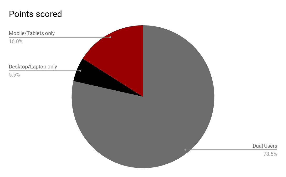
More than 70% of people are using their mobile devices to browse the internet at least some of the time, and of that 70%, around 20% of them are exclusively browsing the web via their phone or tablet. That’s a lot of people seeing your mobile website and never viewing your desktop site! So why not turn the traditional design strategy on its head to ensure all of your visitors are getting the best experience possible.

With more companies exploring the benefits of a mobile-first approach, “graceful degradation” and “progressive enhancement” have emerged as buzz words for this movement.
The idea is that starting with a design built for a large screen inevitably leads to having to come up with a scaled-down, lacklustre version to fit within the limitations presented when building for smaller devices, such as smaller screen size and processing system.
By starting the project on a small device, you are forced to streamline your message and prioritize your content, putting exactly what the visitor came to your website for, front and center. From there you can enhance your website instead of having to decide what you are able to cut out of your design while still keeping it functional. You get to build on the crucial framework you have already set out with all of the added features a larger device offers.

What is the difference between “responsive” and “mobile-first”?
With a responsive website, your desktop website automatically resizes to fit whatever device it’s being viewed on. There are two downsides to this method. The first is that visual aspects of your website may translate poorly on a smaller screen. Too much content, difficult navigation, slow loading time, and poorer overall aesthetic value, are all problems you can come across with a responsive design. Secondly, it can negatively affect your SEO. Some search engines will rank your website lower if it’s not optimized for mobile. You want to ensure that your website works across all devices as seamlessly as possible. With the mobile-first approach, you are creating a different website specifically for mobile users. That way you know your website is optimized in every area to be user-friendly.
All of this doesn’t necessarily mean mobile-first is the right choice for your brand. Take into consideration the situational context. What’s your typical customer base, and what device are they using to search for your product/service? Use the answers to those questions to guide you to deliver a positive user experience.
Take a look at our work to see how Web3 implements these different design and programming approaches.